Most recent BDB-Lab papers
BDB-Lab Links
Major Projects
Other Links
Lab Members
Twitter feed
Tweets by BigDataBiologyTrue Colors: palettes are also important for scientists
by Jelena Somborski, Celio Dias Santos Jr., Luis Pedro Coelho.
Abstract: Accurate data visualization is essential in scientific communication. Scientific colormaps must represent data fairly and be universally readable. This post summarizes guidelines and tips for utilizing colors in data visualization.
Background
In scientific communication, accurate data representation is crucial. Colormaps are value arrays that determine the colors for images, figures, and other graphical objects. They have an important role in data visualization since for humans, color vision is a potent and fast way of acquiring information. Adding colors is much more than adding an aesthetic component to data presentation. Thus, colormaps are essentially used to distinguish clearly and effectively one element from the other. However, poorly used colormaps can visually distort data, making them obscure and confusing, especially affecting groups of people with some level of color vision deficiency.
Colormaps are most frequently divided into several classes based on their functions [1, 2, 3]:
Sequential, are commonly used for representing data with order (Fig. 1). They often use a single hue, while lightness and saturation change gradually. Shades assigned to data are used to emphasize underlying order and are great for visualizing numbers going from low to high, such as age or temperature.
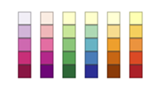
Figure 1. Examples of sequential palettes from Color Brewer.
Diverging, also known as bipolar or double-ended, uses gradients of two different colors (hues) that meet in the middle at an unsaturated color (Fig. 2). They are typically used to represent a scale with a significant value at or near the median. This middle value is often represented by white or a bright shade of gray, while diverging shades emphasize extremes on both sides.

Figure 2. Examples of diverging palettes from Color Brewer.
Qualitative (nominal) colormaps often use miscellaneous colors, representing a collection of scattered, unordered classes (Fig. 3). Nominal or categorical data such as gender, genre, countries, and environments cannot be ordered or ranked, and therefore are successfully distinguished if represented by different hues. These colormaps are maybe the most challenging to use, as too many different colors can create a lot of confusion in data reading.
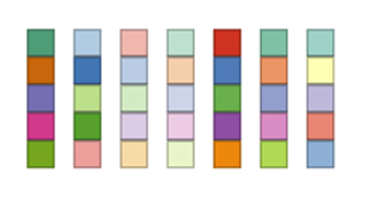
Figure 3. Examples of qualitative palettes from Color Brewer.
Due to the wide spectrum of multiple hues, rainbow-like colormaps such as Jet and Turbo were in the past commonly used for representing qualitative data. They were even applied as a default palette in most common visualization programs and libraries [3, 4]. Today, rainbow-like palettes are not considered appropriate for scientific visualization. However, their use continues to persist, mostly because of their aesthetic attraction but also due to the passive selection of colormaps in data representation. The extreme values in the standard RGB are quite prominent in rainbow-like colormaps, a sequence of hues commonly described as making up a rainbow (red, orange, yellow, green, blue, indigo, and violet), distracting from the underlying visual message. Lacking a meaningful smooth gradient when printed in black and white, they are also partially or completely unreadable for readers with common color-vision deficiencies [3].
Cyclic colormaps (Fig. 4) use the difference in brightness between two separate colors that meet symmetrically in the center. These colormaps begin and end with unsaturated color. They are used for presentation values wrapping around at the endpoints, such as phase angle, wind direction, or time of day [1].

Figure 4. Examples of cyclic palettes from Matplotlib.
General principles
Scientific colormaps must be intuitive and distortion-free. We generally recommend using a professionally-designed palette (such as one from Color Brewer), because they will have taken into account many important constraints when they were designed [4]:
Pairing red and green should be avoided since a significant fraction of the readership cannot distinguish between these two colors.
Combining multiple different colors with similar luminosity shouldn’t be placed side by side.
A smooth lightness gradient is needed so the colormap can be readable if printed in greyscale.
Perceptual uniformity must be considered: to the human eye, the green-cyan portion of the color spectrum has less contrast than the yellow-red portion. Greenish colors conceal low-amplitude data variation compared to reddish hues that intensify them.
In the case that already available scientific colormaps [1, 5] for some reason do not meet the needs (for example, when plotting a larger number of data classes), creating a new unique colormap is always possible. Besides the tips mentioned above, there are some suggestions that can also be helpful [6]:
Instead of using many different colors from the color wheel, only a few hues should be used, most preferably complementary colors and their neighbors (for example, combining blues with warm colors such as yellow and orange). There are different color calculators available on the web, such as Online Color Picker or Paletton, that could be very helpful tools for understanding and estimating color harmony.
Bright, highly saturated colors should be avoided. Although they instantly catch the attention, they are not easy on the eyes and hence not appropriate for communication.
Avoiding too little or too much contrast with the background means choosing again pastel or saturated colors, which is not a great option. If all categories are equally important, each of them should appear similar in contrast with the background and each other. The background should be desaturated enough so the data can be read easily and communicated confidently.
The readability of every color map can be easily checked by printing it in black and white.
When compared to qualitative maps, there is a significantly wider selection of sequential and divergent pallets available on the web. Colorbrewer color maps [2] are very popular and available via an online tool for manually producing and exporting a range of discrete color maps, which can optionally be color-blind friendly and saved to a variety of formats. With cartography as its primary goal, this web application provides sequential, divergent, and qualitative colormaps. However, Colorbrewer doesn’t provide more than two, 12-classes qualitative palettes. Also, if the colorblind safe option is chosen, only the one 4-classes palette is offered. According to Crameri & Shephard, scientific colormaps include sequential, diverging, and cyclic palettes [4, 6], Among them, only sequential ones can accurately represent categorical types of data [4].
In an attempt to find a solution for visualizing more than 20 different categories of data, the color palette shown in Figure 5. was created for this demonstration.

Figure 5. A Colorgorical screenshot: an example of a unique qualitative palette containing 22 colors displayed as (A) a swatch or (B) randomly generated plots; (C) perceptual distance of colors
The palette contains 11 complementary colors, offering different hues with similar brightness levels. Colors are chosen based on the rules and suggestions described above, using the Online Color Picker [8]. The palette was created using Colorgorical [9], the open-source tool for creating qualitative color palettes. It also offers examples of plots (cartographic, bar, and scattered) as a preview and displays the distribution of chosen colors in terms of perceptual lightness and hue.
From Fig. 5, it can be concluded that the perceptual distance between certain colors is not enough. That means certain shades are very similar and if we greyscale the palette, our eyes would perceive them as the same. Yellow is included in the palette as a good option in case some category needs to be emphasized. The palette presented here is far from the final solution when it comes to the visualization of large numbers of categorical data. It rather shows the complexity of actively developing qualitative color maps, according to all aforementioned suggestions. For example, if pairing red and green is avoided and a similar brightness level is kept, it is difficult to isolate 20 or more colors that are perceptually distinctive enough.
Applications of an optimized color palette to bioinformatics
The color palleted presented in Figure 5 was applied in plotting data from the AMPSphere project [10], in order to show the overlap of peptides from different environments (Fig. 6A). For comparison, the same diagram is plotted using the qualitative palette 8-class Dark2 from Color Brewer. The initial 22 classes from the database were grouped into 8 classes of environments, and 20 classes of different species guts. Since the diagram with 20 classes is incomprehensive, only the diagram presenting classified environments is used for demonstration. Speaking of qualitative colormaps, if more categories need to be presented, requiring the usage of different hues, the type of diagram should be simplified. In any case, the presentation of a large number of unordered categories in the same graphic should be avoided in order to make the information equally accessible to everyone. In such cases, using subplots can be beneficial.

Figure 6. Overlapping between AMPs related to different environments from AMPSphere database presented using the (A) custom qualitative color palette and (B) the 8-class Dark2 palette from Color Brewer
The Chromatic Vision Simulator [11] was used to check how a figure would appear to people with the most common types of color vision deficiency Fig. 7). This example may be useful in demonstrating how data presentation can be confusing for people with color vision impairments. Despite being very eye catchy and quite popular in data visualization, chord diagrams are not so straightforward to read. Presented only as a figure, without the hovering option, it could be unreadable to people with color vision deficiency. In the desire to impress the audience with unique diagrams and pleasing colors, the primary goal of information communication may be overlooked. Anyone who reads the figures should be able to understand the information without any ambiguity.

Figure 7. The simulation of how people with color vision deficiencies perceive the diagram using the created color palette (A) and the qualitative color palette from Color Brewer (B). The visual deficiencies simulated with the program were: C – common vision; P – protanopia; D – deuteranopia; T – tritanopia (created by The Chromatic Vision Simulator).
From Fig. 7 it can be concluded that both color palettes performed similarly in visual simulation for most common color deficiencies. Most colors from both palettes cannot be recognized by color-deficient persons, so they could distinguish only a few different nuances, perceiving 8 categories as 3 or 4.
Conclusions
The ideal qualitative colormap does not exist, and it is impossible to impress everyone with selected shades. Therefore, the standard color palettes (e.g., those from ColorBrewer) should be used whenever possible given the efforts to ensure accessibility and reproducibility. In cases where there are more than 8 data categories to be presented in the same figure, various open-source tools can help empirically learn more about colors and create visuals that are equally understandable to every reader.
References:
- Matplotlib documentation, from www.matplotlib.com
- https://colorbrewer2.org/
- Moreland, K (2009): Diverging Color Maps for Scientific Visualization (Expanded). Proceedings of the 5th International Symposium on Visual Computing, pp 92-103
- Crameri, F wt al.(2020): The misuse of color in science communication. Nature Communications 11(5444)
- Crameri, F. (2018): Geodynamic diagnostics, scientific visualization and StagLab 3.0. Geoscientific Model Development 11(6):2541-2562
- Scientific colour maps by Fabio, C & Shephard, G. E. available at: https://zenodo.org/record/5501399#.Y1WssnZByUk
- https://blog.datawrapper.de/
- https://colorpicker.me/
- http://vrl.cs.brown.edu/color
- Santos-Júnior, C.D. et al (2022). AMPSphere: the worldwide survey of prokaryotic antimicrobial peptides (v.2022-03) [Data set]. Zenodo. https://doi.org/10.5281/zenodo.6511404
- https://asada.website/webCVS/index.html
Copyright (c) 2018–2026. Luis Pedro Coelho and other group members. All rights reserved.